Case Study
NextStop AR
Augmented Reality for Transit Navigation

Problem
Navigating the Massachusetts Bay Transportation Authority (MBTA), also known as the Boston T, can be confusing, especially for tourists unfamiliar with the system. Through observation and secondary research, we identified common pain points such as: unclear signage, complex station layouts, unfamiliar terminology, language barriers, and accessibility challenges. Our primary target users were tourists new to Boston who needed clear directional assistance within T stations.
Hypothesis
How might we design a mobile app that improves navigation within the Boston T to provide users, primarily tourists, with a more intuitive, accessible, and stress-free navigation experience.
My Role
I led and worked collaboratively with a UX design team to conceptualize and prototype the solution in Figma. I contributed to competitive research, ideation, sketching, interface design, and interaction design. We worked together to evaluate ideas, refine the overall concept, and iterate on prototype fidelity, focusing on accessibility and usability priorities.

Research & Testing
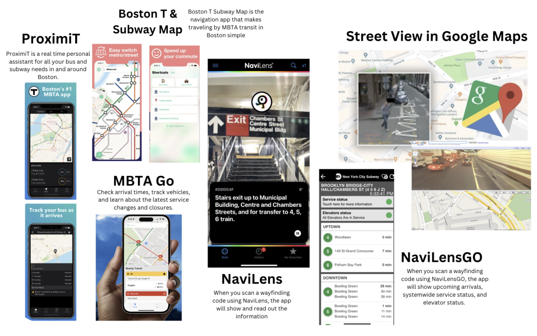
We began by researching existing transit and navigation tools, including ProximiT, MBTA Go, and NaviLens. This helped us identify strengths, weaknesses, and gaps in the current product landscape.
Due to a short timeline, we gathered primary insights from App Store reviews and Reddit discussions to understand real user frustrations. One gap we noticed was that no existing solution effectively combined real-world navigation with live visual cues inside stations.
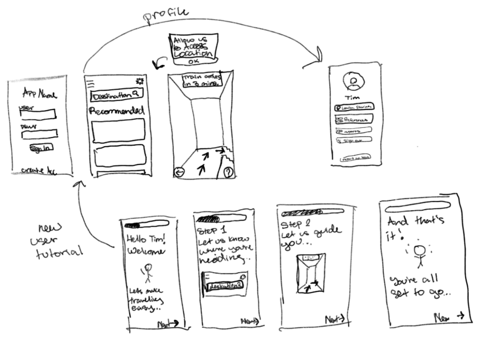
Each team member created five rapid sketches. After brainstorming multiple approaches, we aligned on one of my proposed ideas, an AR-based navigation app that overlays directional arrows within the station environment.
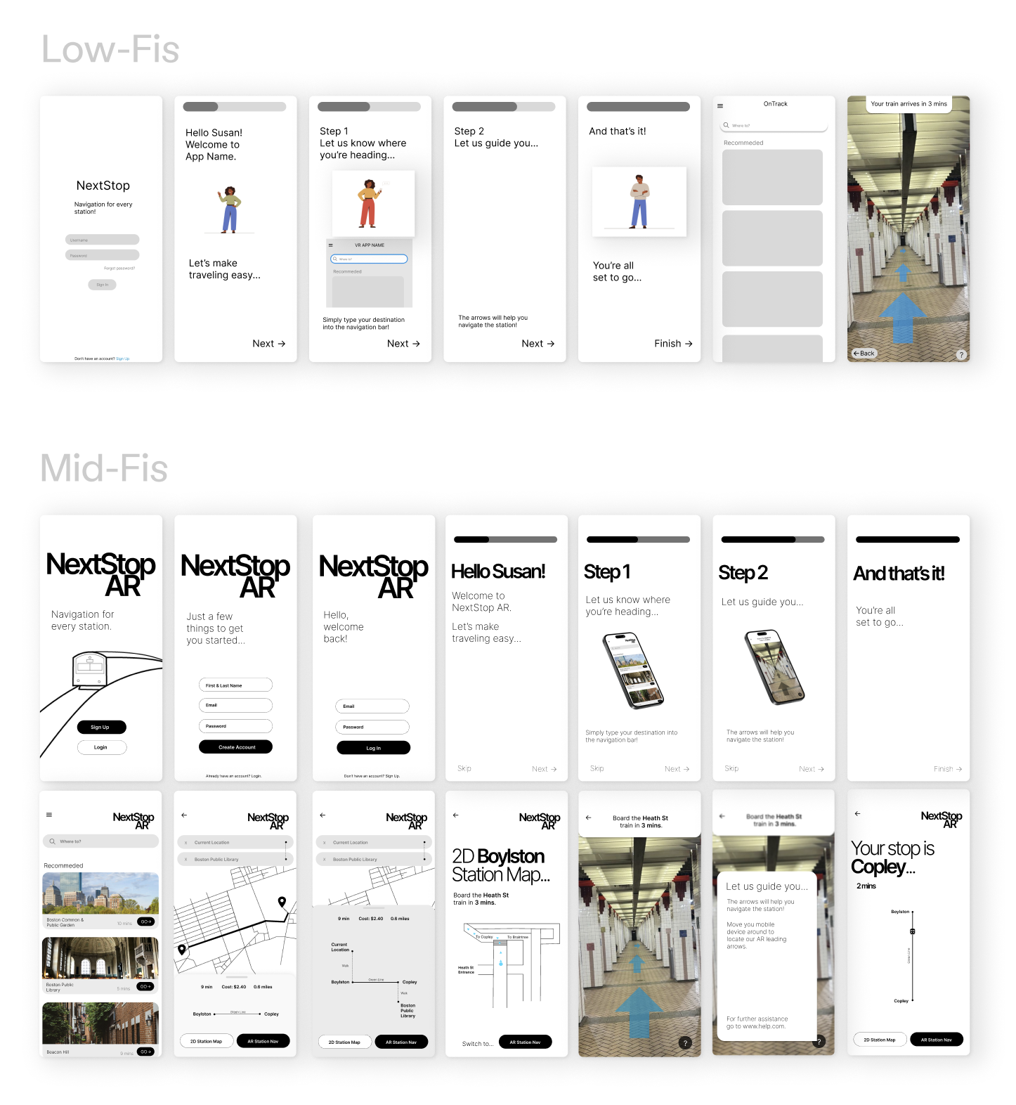
Recognizing that augmented reality could be unfamiliar to users, we prioritized onboarding early in the design process to clearly explain how the feature works.
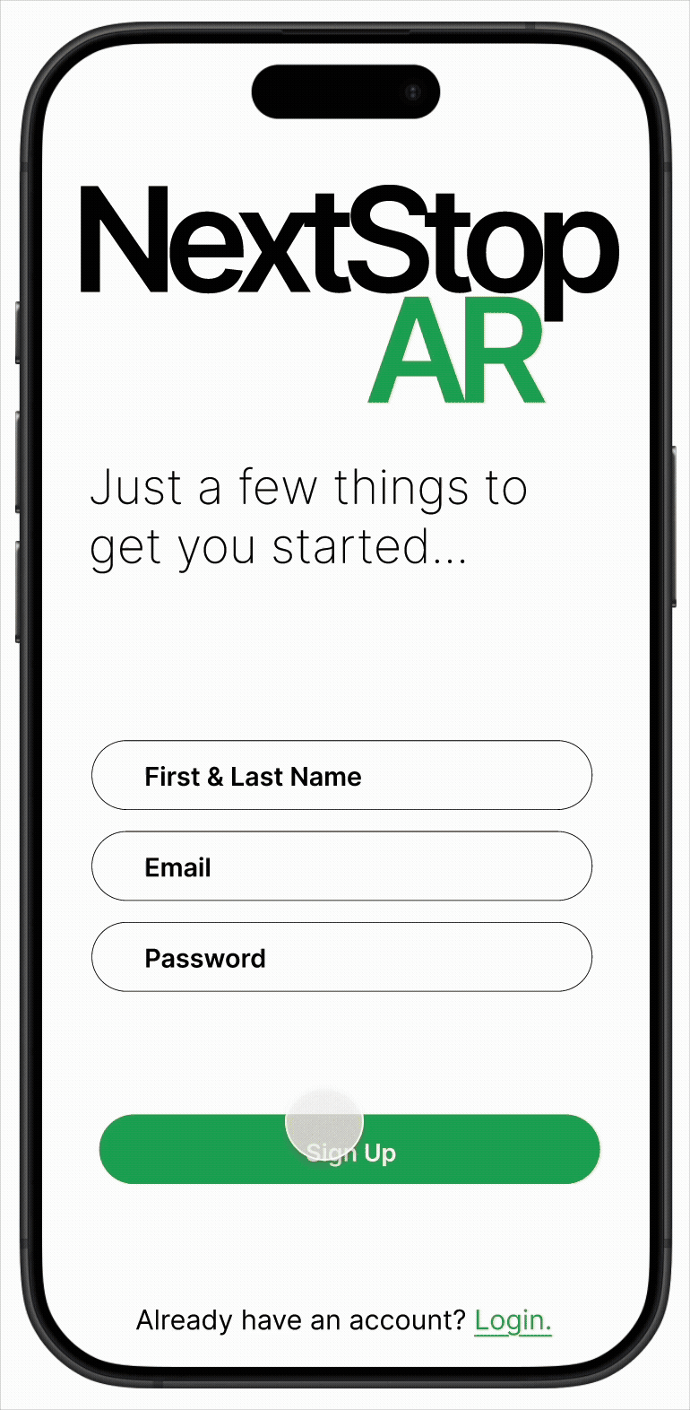
We iterated from low- to medium-fidelity prototypes, experimenting with color and visual hierarchy. Ultimately, we chose a minimal black-and-white interface with the recognizable MBTA green for emphasis to maintain clarity while aligning with the transit system’s visual identity.
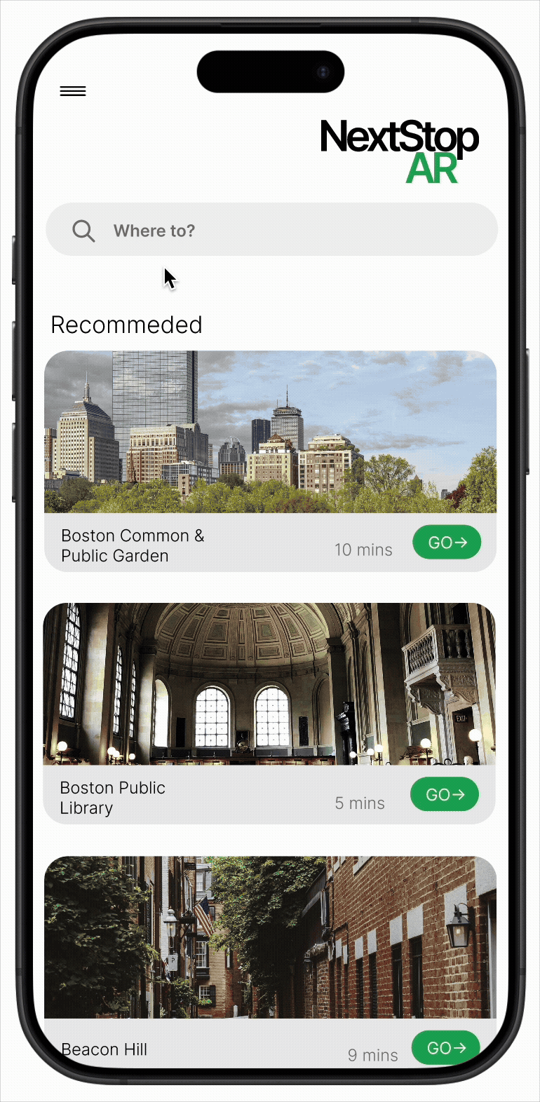
Solution
NextStop AR allows users to hold up their phones and follow AR arrows overlaid onto the real-world station environment, guiding them step-by-step to their train or destination. The solution addressed unclear signage by replacing ambiguity with direct visual arrows, complex layouts by providing real-time directional guidance, language barriers by relying primarily on universal visual cues, and accessibility concerns by considering alternative routing and clear, high-contrast visuals. By merging physical space with digital wayfinding, the app reduced cognitive load and improved clarity for both tourists and regular commuters navigating unfamiliar lines.
Challenges
Due to a limited timeline, we relied on secondary research rather than conducting in-depth user interviews, which constrained the depth of our insights. Early concepts explored more traditional 2D navigation patterns, but these lacked differentiation from existing solutions and pushed us toward AR. We also iterated extensively on color choices to balance clarity, accessibility, and innovation, while addressing concerns around user safety and distraction in a fast-paced transit environment.
Impact
The prototype demonstrated how AR could modernize transit navigation and improve accessibility within Boston T stations. By addressing navigation frustrations, the concept showed potential to enhance rider confidence, reduce confusion, and create a more tourist-friendly transit experience.