Project
Petrichor
Beverage Branding & Packaging Design
Problem
This was a project I worked on for my Identity and Brand Design course. Our task was to observe beverages in the world and then build our own brand. I found it interesting how water, something that is a daily necessity, could come in so many different forms with their own individual brand tones and personality. I took inspiration from water brands like Voss, but wanted to create a brand that felt more connected to nature and the environment. My goal was to create a brand that not only provided a refreshing beverage but also inspired consumers to embrace a lifestyle that values and protects the environment.
Research & Testing
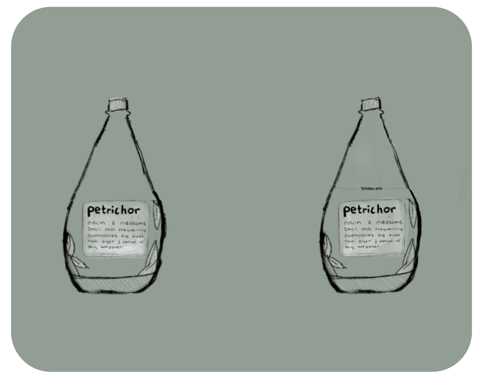
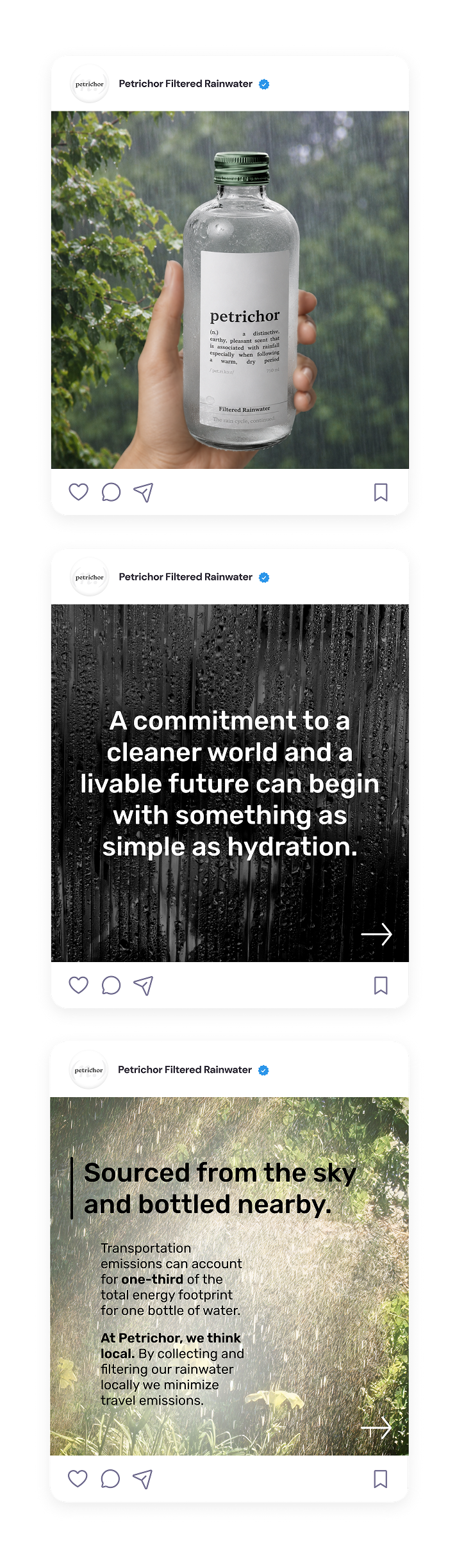
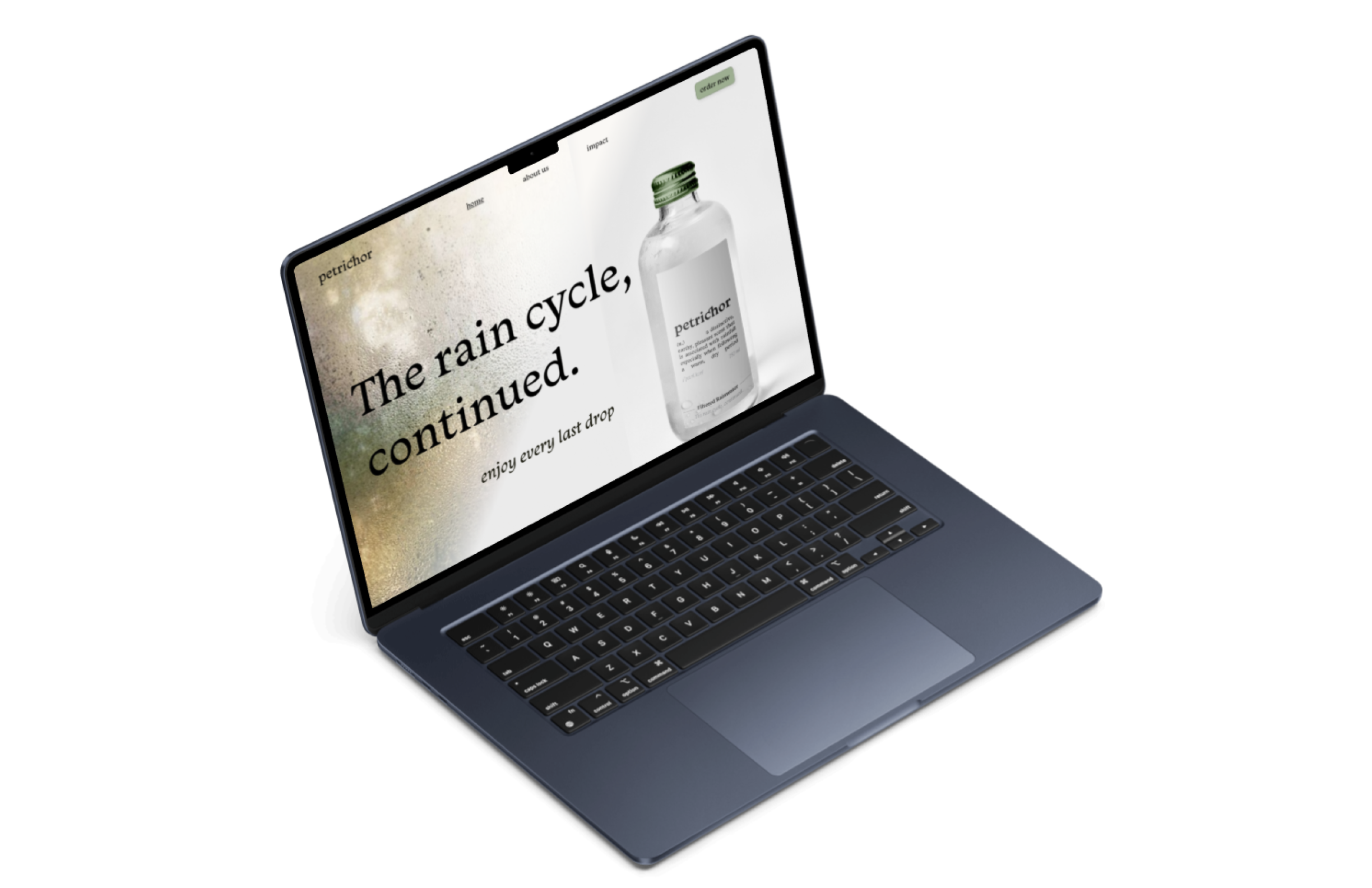
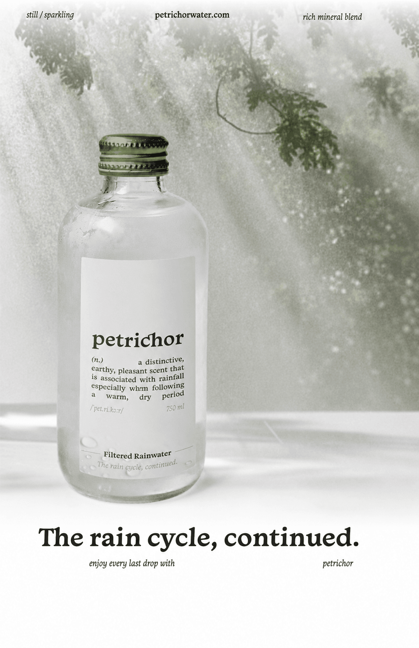
The initial idea stemmed from the word petrichor and from there I built a water brand that echoed the and natural essence of this word. Every design choice was intentional, from the water-drop shape of the bottle to its glass material. I chose to let the features of the typeface do most of the talking for the logo. The sparkling water variation was signaled through the sun rays around the word sparkling, meant to convey the effect of sun reflecting off of water.
Solution
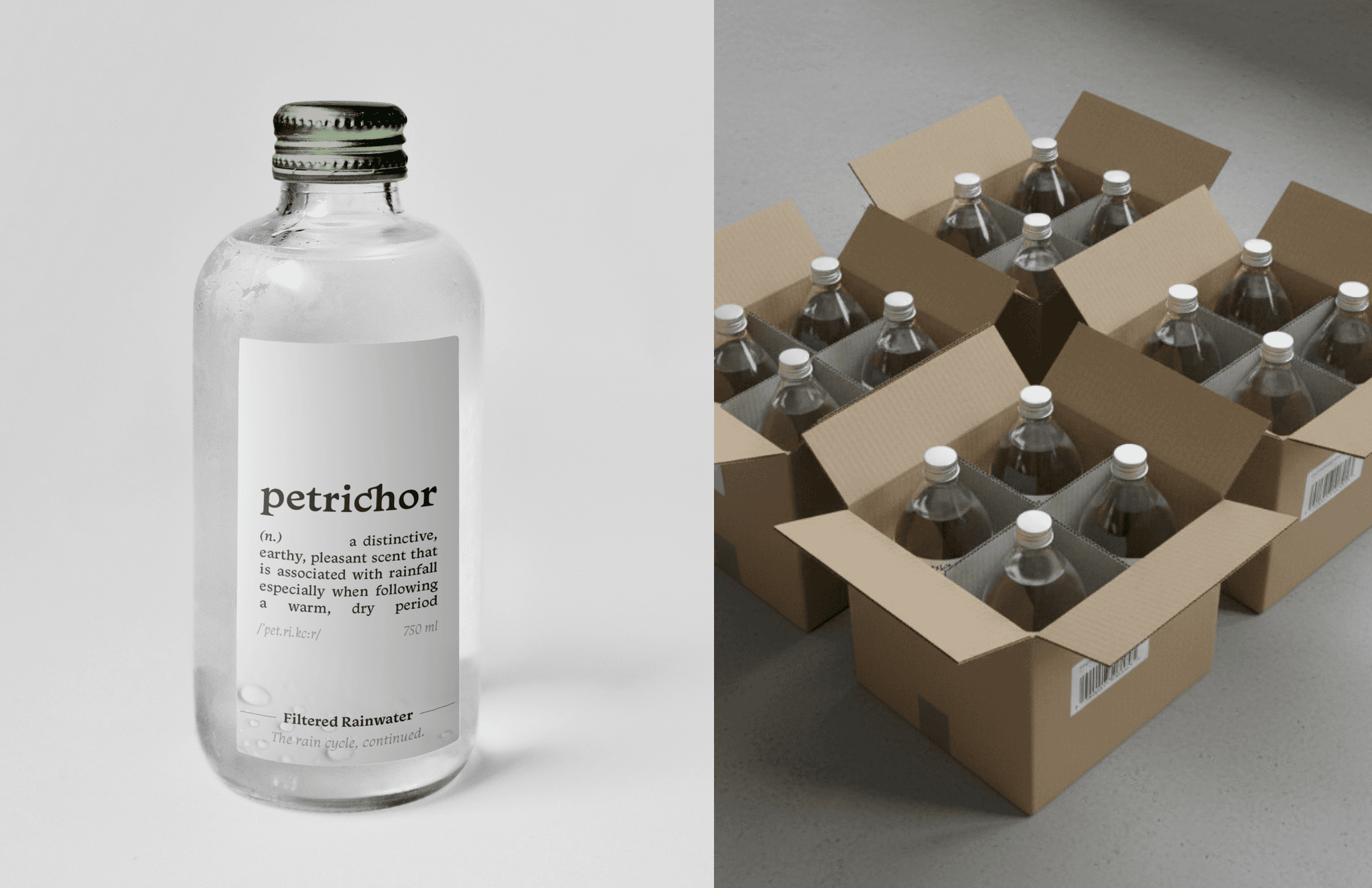
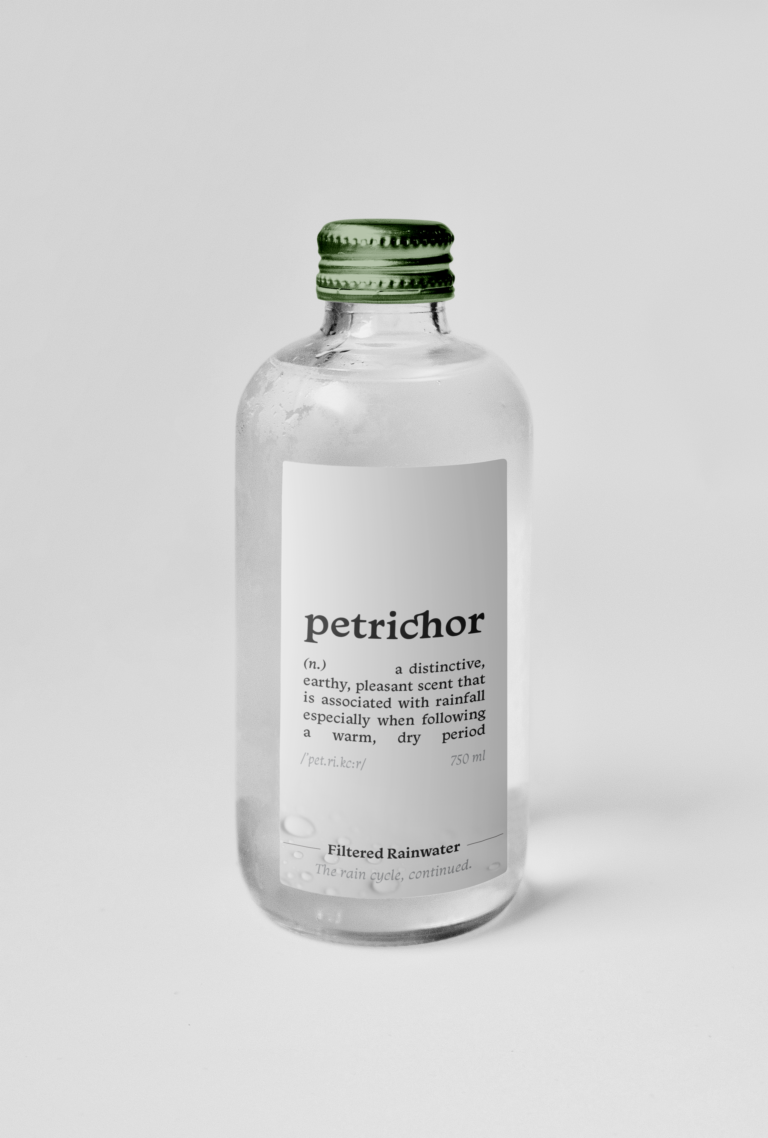
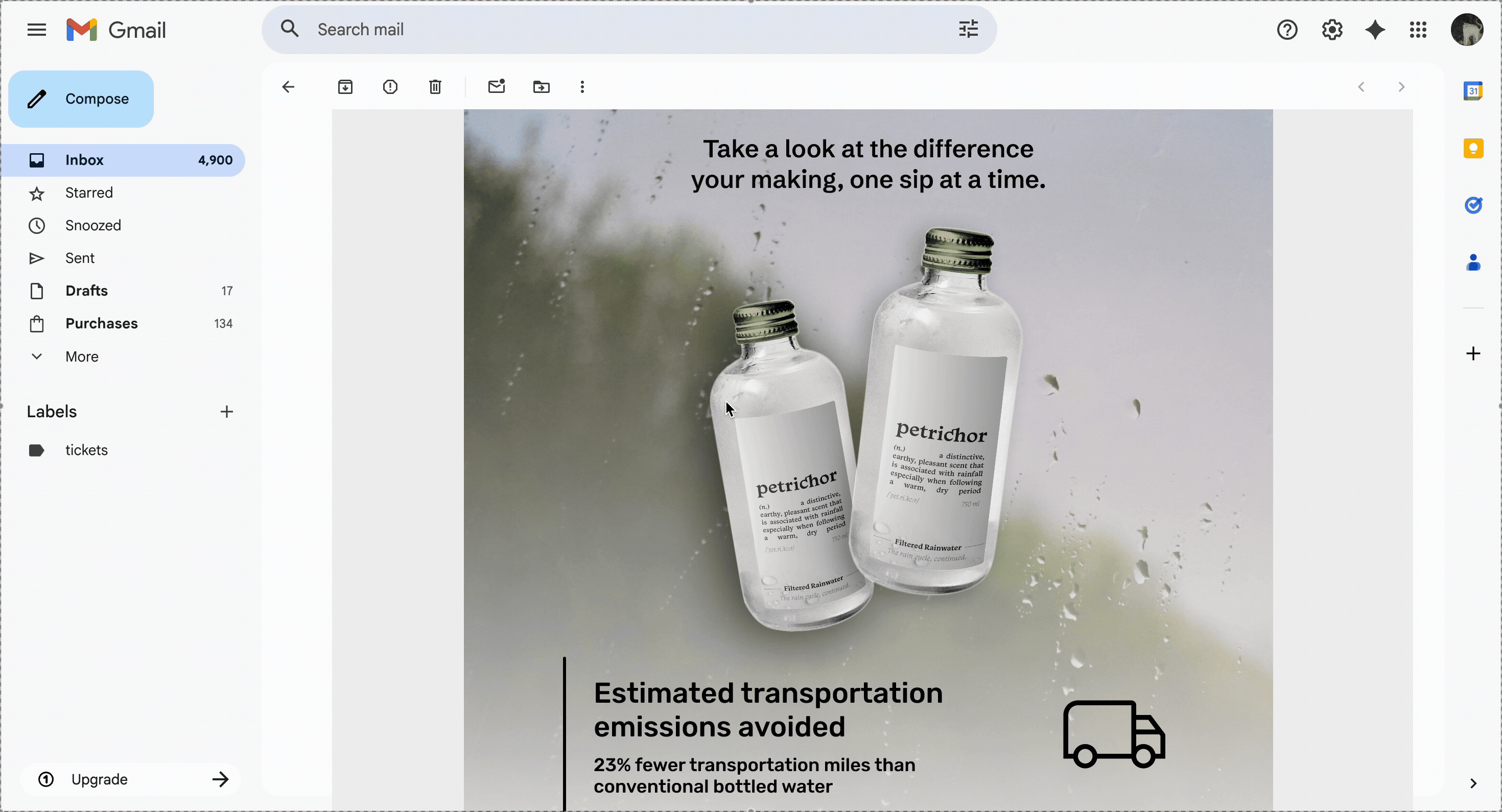
Petrichor is a brand that embodies the idea of eco-friendly products as it is continuing the rain cycle by filtering rainwater and making it safe to drink. The name Petrichor refers to the pleasant, earthy scent produced when rain falls on dry soil, symbolizing renewal and freshness. As a brand, Petrichor is dedicated to creating sustainable, environmentally conscious water beverages that not only provide everyday refreshment but also promote a deeper connection with the natural world. In order to enjoy the smell of petrichor, you have to be outside in nature, and that is the feeling I wanted to evoke with this brand. From glass, reusable packaging to ethically sourced ingredients, Petrichor aims to inspire consumers to embrace a lifestyle that values and protects the environment.
Challenges
One key challenge was the current infeasibility of large-scale rainwater consumption due to purification limitations, requiring the concept to remain speculative. Balancing poetic, nature-driven branding with credibility also required careful control of visual complexity. Additionally, ensuring the minimal logo felt intentional rather than under-designed involved thoughtful typographic refinement and attention to detail.
Impact
Petrichor’s touchpoints include the logo, packaging, labels, and advertisements. Each touchpoint was crafted to reflect the brand's commitment to sustainability and its connection to nature.The logo features a minimalistic design, letting the Adobe Monarcha typeface do the talking. The typeface appears rhythmic, like rain, and feels even a bit poetic. The packaging is made from glass, a sustainable material that can be reused and recycled while the shape itself resembles a water droplet, reinforcing the brand's connection to water and nature. The labels are designed to be simple, reflecting the purity of the product, while also incorporating elements like the definitions of petrichor.